


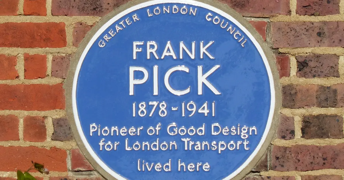
A blue plaque now marks the Hampstead Garden Suburb home of the man who gave London’s transport network its look — from the roundel on every station wall to the lettering on every sign.
The plaque is fixed to a house in Wildwood Road, where Frank Pick lived, and it reads: “Frank Pick Pioneer of Good Design for London Transport lived here.”
Pick, born in Lincolnshire in 1878, is the reason the Tube looks the way it does. Commuters today take for granted the familiar roundel marking each station, the Johnston typeface used on signs across the network, and the patterned moquette upholstery on trains, buses and trams. All of it traces back to him.
From railway trainee to design pioneer
Pick joined the North Eastern Railway in 1902 as a trainee manager and later became personal assistant to its general manager, Sir George Gibb. When Gibb became managing director of the Underground Electric Railways Company of London in 1906, he invited Pick to join him.
The company, known as the Underground Group, had taken over the debt-ridden District Railway and was opening three deep-level Tube lines which by 1907 were in serious financial trouble. The future of the Underground was very much in the balance when Albert Stanley, later Lord Ashfield, took over in a last-ditch bid to save the business.
Stanley gave his staff six months to turn the company around — and, crucially, gave Pick freedom to develop his ideas about publicity.
Pick, with no previous experience in the field, began with eye-catching posters to encourage people to travel, then turned his attention to stations, signs and branding. One of his first initiatives, in 1908, was to help create a coordinated network to increase ticket sales, allowing passengers to buy tickets across the different operating companies and introducing colour-coded maps showing the whole network.
He started a Traffic Development and Advertising Department for the Underground Group and became its commercial manager in 1912.
The look of London
Pick changed transport poster design by moving away from words and towards images, promoting the theatres, zoos and parks that Londoners could reach by Underground. Designed by leading artists, the posters showed a city within easy reach of its travellers.
He was also shaping the network itself. When the Underground Group took over the London General Omnibus Company in 1912, he helped plan and promote bus and Underground services, walking miles to study existing routes and consider where people might travel. His work led to new bus routes, services and links between buses and Underground stations, advertised on posters and popular with commuters.
Then came the typeface. Pick wanted the Underground to have a recognisable identity and began testing a new lettering style to replace the different styles used by separate companies. In 1913, calligrapher Edward Johnston was asked to create an official typeface, which became known as Underground Railway Block and later simply as Johnston. An updated version, Johnston100, is still used exclusively by Transport for London today.
Pick also standardised the roundel, writing an exact specification of its proportions, colours and lettering that remains in use today.
Stations, seats and a lasting legacy
During the 1920s and 1930s, as the Underground expanded, it was Pick who selected architect Charles Holden to design practical, easy-to-use stations — including a new entrance for Westminster station in 1922, stations on the Morden extension of the Northern line in 1926, and stations for the Piccadilly line extensions between 1931 and 1933.
He also commissioned established and new textile designers to create branded moquette, the patterned upholstery still used on seating today. And he commissioned and agreed the design of the circular ticket hall at Piccadilly Circus, one of the network’s most recognisable interiors.
Pick lived in the Wildwood Road house until his death in 1941. The plaque on its wall is a small marker for an outsized legacy: almost everything a Londoner sees, reads or sits on while travelling was shaped, directly or indirectly, by his insistence that public transport should be well designed.
The plaque sits in the London Borough of Camden, which continues to add new neighbourhood landmarks of its own — including a Waitrose convenience store due to open in Chalk Farm in 2028. Pick’s marker, though, is of a different order: not a new arrival, but a reminder of the man who designed the city millions of people move through every day.
Next time you pass through a station, look for it: the roundel, the lettering, the pattern on the seat. That is Frank Pick’s London, still working, more than 80 years after his death.
Photo: the Frank Pick blue plaque in Hampstead Garden Suburb. Credit: Megalit, CC BY-SA 4.0 via Wikimedia Commons.